
My Role: Project Manager, Design Integration Lead
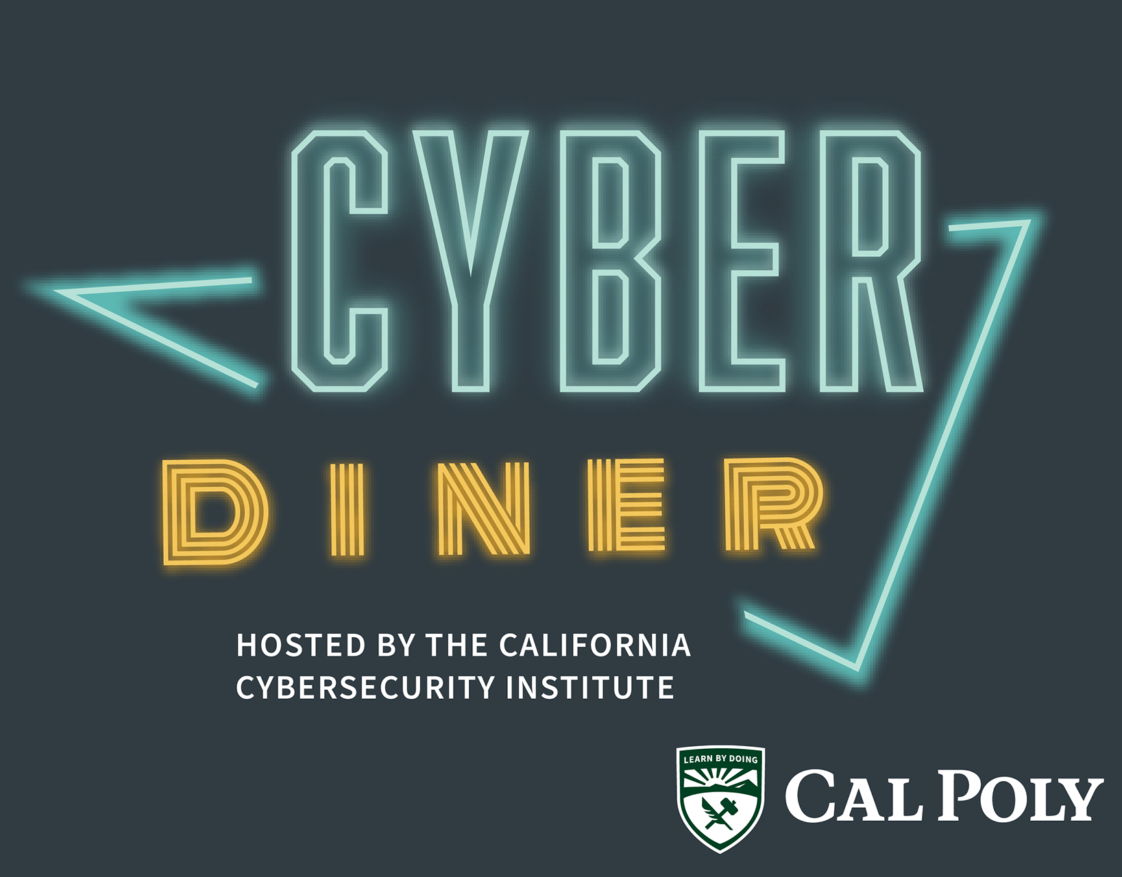
The Problem: After five years of initial growth, Cal Poly California Cybersecurity Institute, a non-profit training and research center, had a major problem. Despite being a leading training provider in California and having the resources to grow substantially in 2021, their website failed to convince anyone that they meant business.
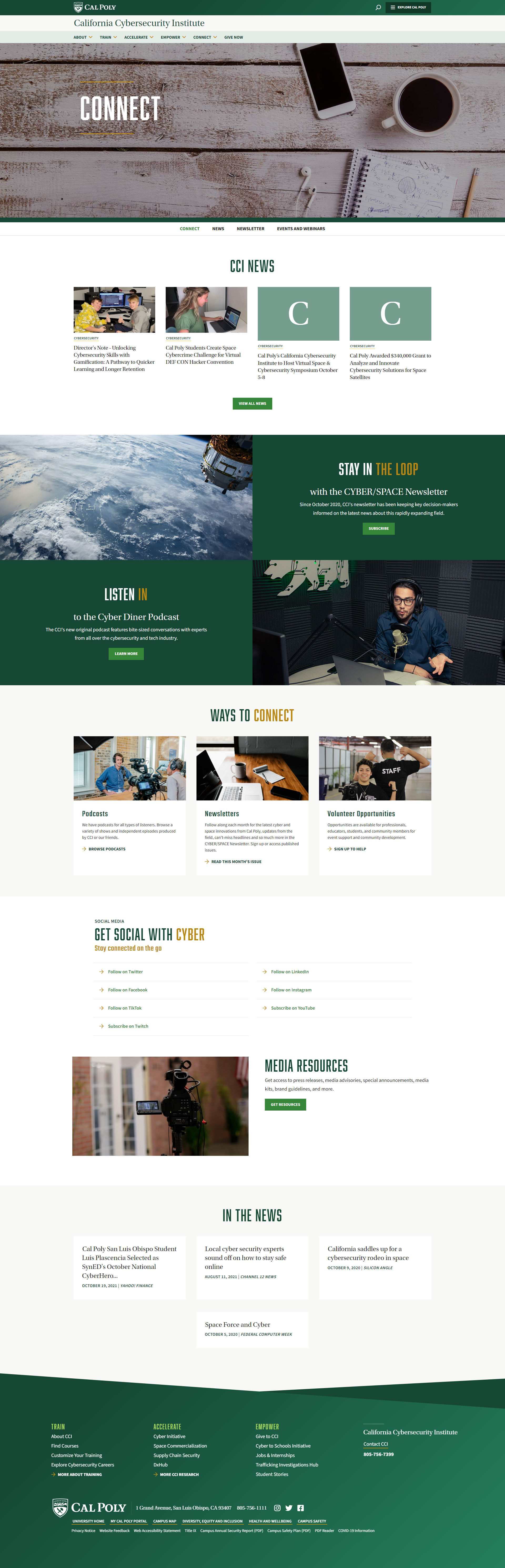
Stuck in an old design system from the late aughts, the CCI needed to port their site over to the University's new platform, update its content design to be easier to navigate, and incorporate modern UX principles.
Note: The following link takes you to the one Subpage of the website that still exists from my redesign effort. Since I left, the department lost funding and has reverted most design pages to info pages. Unfortunately, I don't have many screenshots of the design i helped create.

Pitfalls
The old site was fraught with an antiquated design template, confusing site navigation, unclear CTAs, and lacked evidence of any kind of modern visual design. It looked like the kind of site you could hack with a microwave, which didn't bode well for the brand of a cybersecurity institute.
In an industry that exists because of the internet, CCI's online presence prior to 2021 just wouldn't cut it. Staff and stakeholders were hesitant to refer potential customers or business partners to the site because it didn't tell the same story they were telling offline.
Customers had trouble finding and enrolling in training courses on the website, and CCI relied on asking customers to email to be enrolled in training instead, putting unnecessary strain on an already small staff.
The homepage was clunky and difficult for staff to update. It was not uncommon for the same news story to be on the front page for six months to a year. Outdated information led to users being confused about what trainings and events were being currently offered.
Solutions
Integrating the University's new design system solved the outdated appearance problem for the most part, but I still pushed for the integration of modern content design within that framework. Content blocks were built around succinct, visual appealing UX principles.
To adapt the design system our needs, I worked directly with the third-party build team to create content types for our training courses, and also for our student success stories. The main goal was to make it easy for non-technical staff to create new web content to share via email & social campaigns, and show off the productivity of the program to stakeholders. These content types had to be carefully constructed to be specific enough for their categories, but not so specific that customizability was totally lost.
To solve the navigation struggles, we reorganized the main menus and focused on decreasing click depth for our major CTA's. We wanted training customers to be able to enroll in a course within 3 clicks instead of 6. Business partners and potential sponsors should be able to find donor info from the homepage, not from exploring the entire site.