
My Role: Lead Web Designer, Co-Content Designer, Assistant Copywriter
Problem: LiquidPlanner was a late-stage startup that wanted to capture more of the portfolio management market, but it's old website didn't communicate the value of the software clearly enough. The product is unique in its category based on Predictive Scheduling, but site visitors has a hard time finding their way through that story. Additionally, the old site looked outdated, lacked helpful visuals, wasn't content-rich, and just couldn't meet these needs.
Concept: LiquidPlanner would present its six main product pillars alongside images of happy, smart, and confident users and simplified renditions of it's unique UI, heavily featuring the predictive scheduling bars. Drawing inspiration from other project management software sites, and implementing core visuals and color palettes from the product itself, the new design aimed to modernize the LiquidPlanner brand and improve site metrics and conversion rates.
The Old Site
Not bad, but not new
The old website wasn’t poorly designed, but the visual language was falling out of date fast, and didn’t make efficient use of the most prominent areas of the site.
2000s-style hero banners, lo-fi cartoon characters, scattered use of color, leaning too much on icons, option overload, and... full-width video players hogging the hero viewport???
My concern was: we have a product that allows users to predict the future. How are we going to earn their trust with a site that's looking toward the past?
Let's... brainstorm!
Design Goals
-- Shorten the click path to most important CTAs - demo, trial
-- Personalize the product for our personas
-- Show off the product UI without overcomplicating it
-- Make things less busy, give the site more room to breathe
-- Data-driven decisions, don't fix what's already working
All this while modernizing the visual language to resonate with users who spend time on new, high-budget sites.
Design Challenges
-- We didn't have the budget to invest in a dedicated design and build team. It was all on me and a contract coder we had for a few hours per month.
-- Conflicting design philosophies within the leadership team
-- Outdated site backend made any modern updates difficult to execute
Design Solutions
-- Simplify attention: Create space to pull the eye. Viewport-sized content blocks with a single CTA, minimized copy, fewer text styles, use negative space.
-- Show the product: Carefully constructed UI images that conveyed value of key product views
-- Show the people: Images of portfolio managers looking engaged with the product
-- Capture the clicks: Move the most important CTA to the highest converting button sitewide (notification bar).
-- Use color with intention: Use fewer brand colors throughout. Be bold, but sparse.
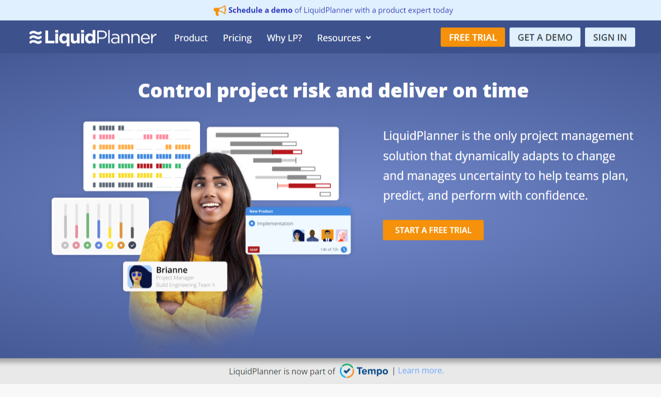
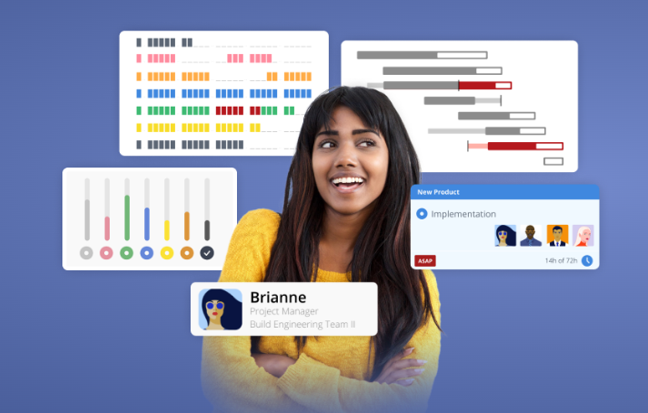
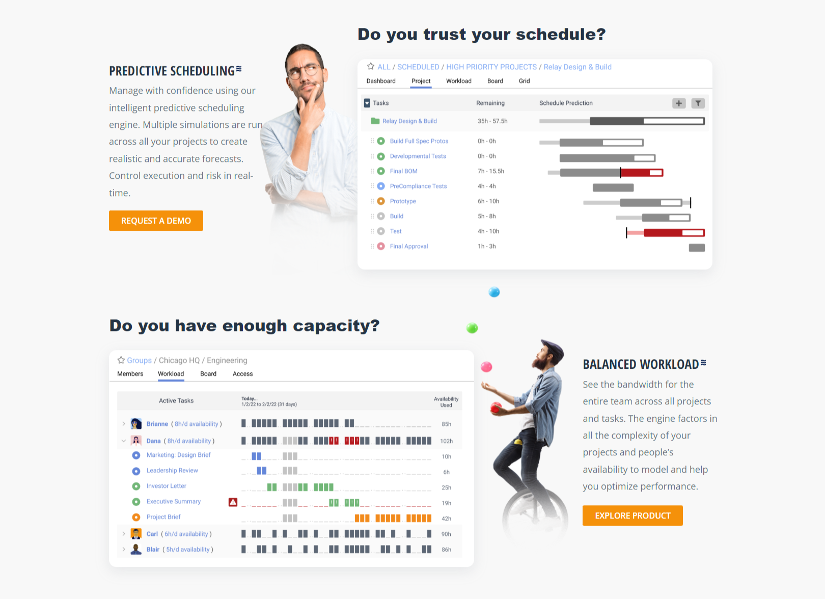
Hero Viewport
The hero image for the webpage was designed with the idea that we wanted to show our hero project manager (Brianne, in this case) in the act of using our product. We placed the most interesting and unique product view (predictive scheduling bars) directly in her line of sight, and surrounded her with other useful elements.
Giving her a name tag in the context of the product was also intentional. I wanted our users to be able to see themselves using the product. "Hello, my name is Brianne, and I use LiquidPlanner to control my project risk and deliver on time."
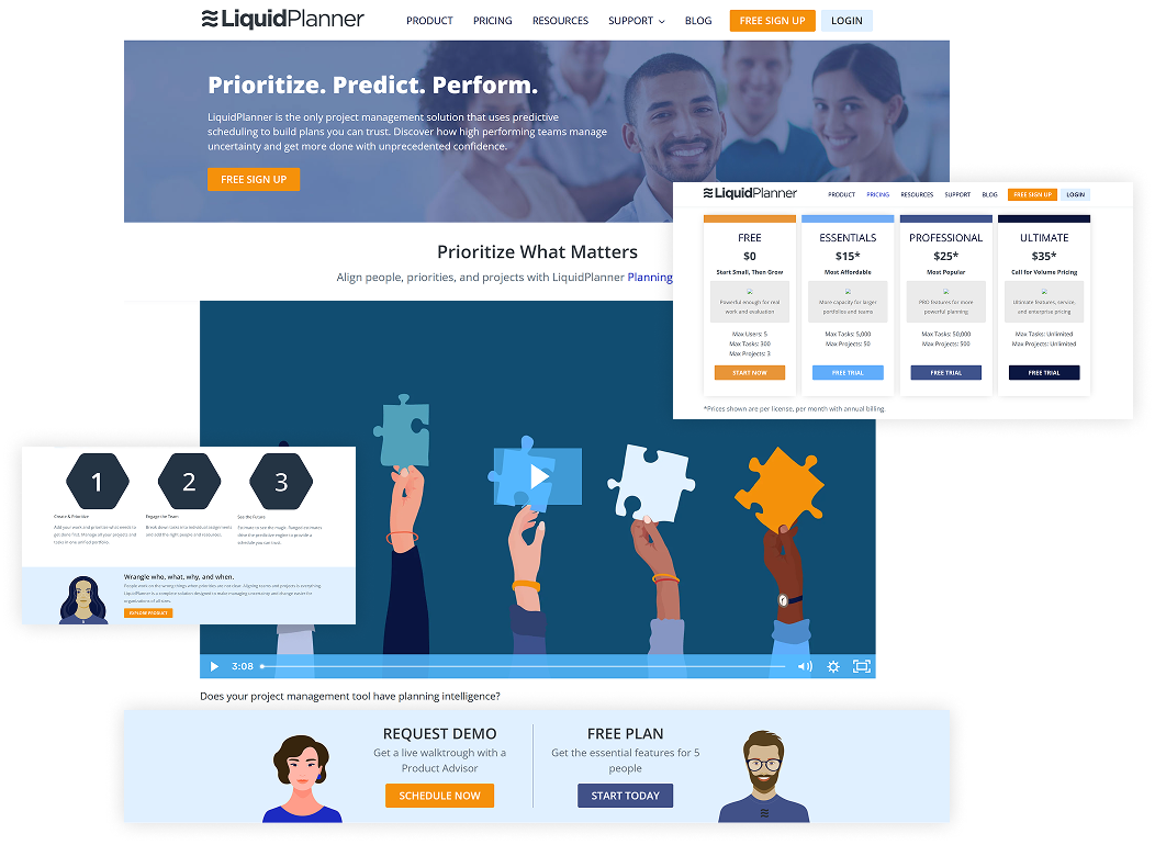
Homepage UI Content
On the homepage, where we're still just grabbing attention, we aligned our six product pillars (written as questions) with the most appropriate product view. We then simplified the product views, and made sure to use the red "alert" UI elements deliberately to show its predictive power.
Our project managers are hanging out in the background, adding context to the product views and introducing human action and emotion.
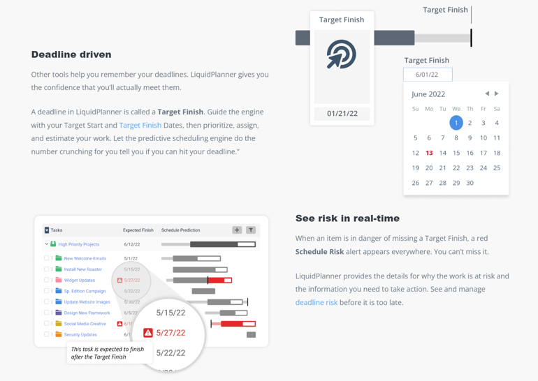
Detailed UI Content
Once users have clicked "Product" in the site nav menu, we know they're ready to learn. We kept it simple on the product pages, breaking out key value propositions into bite sized features and UI elements. These headings were meant to address real human questions and desires, not just show off cool UI animations.
Pulling the UI elements out of context and annotating certain parts allowed us to bring the product to life, highlight components that differentiate it, and give the user a sense of control by providing a "peek under the hood."


